This time I have applied inks directly to the debossed side of the Without A Lock embossing folder. Always make sure you apply the ink to the correct side of the folder. Many times my attention has wandered & I've ended up with the ink on the wrong side.
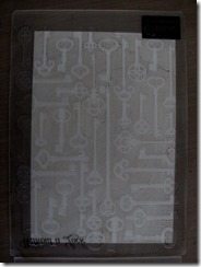
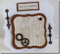
As with yesterday’s post, I’ve used white, hammered textured cardstock. Here, I’ve applied Frayed Burlap distress ink using the ink pad. You get quite a textured result, with different amounts of ink. I blended Antique Linen & Old Paper on top of the keys, because the white looked too stark. This seemed to bring the piece together.
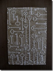
I’ve applied Faded Jeans distress ink onto the folder with a brayer for this piece. You still get some texture, but it looks a little smoother. And I liked how the white looks against the blue, so didn’t put any ink on top.

On this piece I used a Brilliance pigment ink in a sandy colour. It’s very pale, with a subtle sheen & works very well with the white keys.

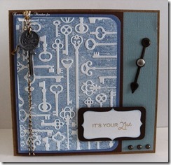
Here are the cards I made. I kept them all very simple, using just core’dinations card in assorted colours & various embellishments, because I wanted the embossed shapes to be the focal point.
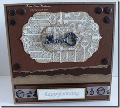
Frayed Burlap distress ink.
Faded Jeans distress ink.
Sand coloured pigment ink.
Thanks for visiting the blog, we appreciate your support. We’ve had the first entries into the new challenge already, if you'd like to join in all the details are on the challenge page.
Until net time, happy crafting.
Kirsten
love your creations!! awesome cards!!
ReplyDelete